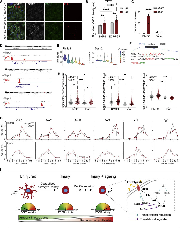
We need to talk about Multi-panel figures. To start with let us consider what information do you usually need to interpret a panel in a ‘figure’?
- The figure itself
- The figure legend
- The place in the text which references the figure
- more often than not at least one disambiguation of a novel acronym
Each of these 4 pieces of information can be located on different pages in a modern manuscript. Yes the figure and its legend are sometimes on different pages (I’m looking at you Cell WTF?). To drive this point home you can be looking at a situation like this: Figure 6(i) was discussed on page 4, printed on page 5 and the legend for which is, for some ungodly reason, printed on page 6! Oh and also the title for the figure is not on the figure but in the legend and helpfully features (YATA) yet another terrible acronym that was defined once in the abstract on page 1.
I don’t know about you but a mere mortal such as myself needs some working memory spare to think about the underlying concepts that a manuscript is trying to communicate to me, and I do not appreciate having to cache as many a 4 look-up tables in my head just to be able to effectively read a figure, let alone reason further about it!
I contend that this problem is worse when looking at electronic representations of formats meant to be printed, at least in part because it is easier to form a mental map of the relationships between these different parts of the manuscript when it is printed. When you have a physical copy the parts have relationships to one another in 3D space that take less effort to construct a mental model of. Also, it’s just easier to arrange the pages so can actually look at the different parts and the same time. e-reader like formats also suffer from this issue as they don’t have fixed pagination so the relationships between objects are still harder to model as they are not even in fixed relationship to one another in a virtual 2D space.
I hypothesize that breaking up figure panels and placing figures in line in the text as they occur would increase reading speed and comprehension, especially in electronic media. I term this information-non locality minimization. This also entails placing information such as titles, abbreviations, and other small details like summary statistics in the figure itself. This instead of unnecessarily relegating this information to figure legends.
Specific hypotheses I’d like to see tested:
- Time taken to read a paper with multi-panel figures will be longer than the time taken when information-non locality is minimised.
- Reading comprehension tests will be worse for papers with multi-panel figures than when information-non locality is minimised.
- Hypotheses 1 & 2 will be true of both electronic and physical media but the effect size will be larger for electronic media.
- Bound copies of papers with multi-panel figures will provide less of an advantage over information-non locality minimised copies than loose-leaf / unbound prints.
- Effect size of the advantage information-non locality minimized versions have over multi-panel figure versions will be larger in people with dyslexia. (I’m dyslexic and it’s been thought of as an issue related to working memory, it may be why this issue jumps out at me.)
If anyone wants to do this research please get in touch. If my hypotheses on reading speed and comprehension work out it would be a ‘fun’ exercise to compute an estimate for how much our collective time and money we have wasted because of bad formatting choices.
Why are we wasting time, energy and mental cycles mentally reassembling properly constructed figures from their component parts which we have strewn willy-nilly throughout our manuscripts? To sum up Multi-panel figures are an anachronistic concession to typesetting colour prints to a compact format for printing and they have no place in modern electronic publishing. They ruin the flow of reading a paper. They represent an unreasonable assault on the working memory resources of a reader who is trying to understand what is likely a complex topic and create undue cognitive load for readers who need their full mental faculties about them to grapple with complex scientific ideas.
Additionally, I think that they encourage bad graphical practices. Panels are labelled not with meaningfully interpretable titles, as both our schooling and basic common sense about presenting information dictates they should, be but with alphabet soup. These are bad practices for which we take school children to task in science classes but which we seem to have collectively forgotten in the peer-reviewed literature. Multi-panel figures should be used ONLY when it is actually useful for the understanding of the content for visuals to be placed together. We don’t need to optimize for printing in electronic formats we can have as many full-size colour figures as we need to optimally convey our point. This would be an improvement even if we stick to pdfs as the primary endpoint paradigm for published articles, the case against which deserves its own discussion.
:::